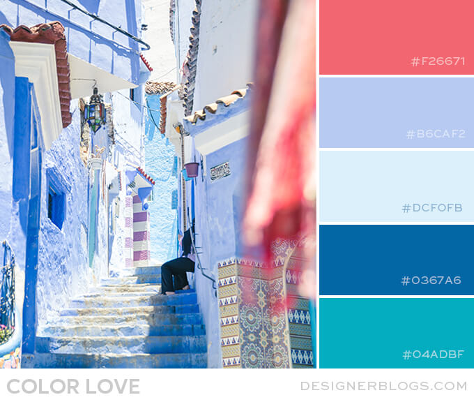
I recently created a stunning color palette called Shades of Blue, and I just had to share it with you!Using blue color in design can evoke a sense of calmness, relaxation, and stability.This palette features four different blue shades, each with its own unique personality.It was all inspired by these gorgeous blue buildings from the photo above.
Shades of Blue Color Palette
Aqua is a refreshing and calming shade, while cobalt is bold and striking.Light blue is a delicate and dreamy shade, and pastel blue is soft and soothing.And to add a pop of warmth, there's a lovely coral shade of red.I think this palette would be perfect for a coastal-themed room or a summer wedding.
As always, we have put together a mood board with some inspiration.It is in perfect Pinterest format, so feel free to pin it for later.
See our collection of other gorgeous color palettes by visiting ourcolor palette section.
What do you think about this Dark Blue & Coral color palette?We would love to hear about the places you see yourself using it.Your feedback means a lot to us, so please feel free to share your thoughts in the comments below.
Make sure you take a look at our blog post aboutthe importance of using color in blog design.It's a really interesting read and will show you just how big of a role colors can play in your projects.
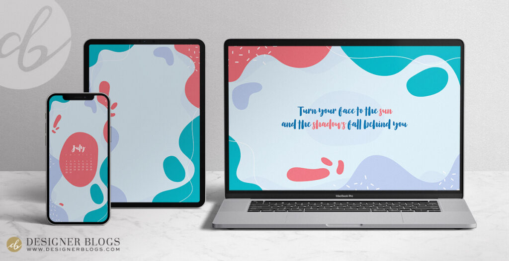
If you're a fan of today's color scheme, you should definitely take a look atJuly's Free Wallpaper.It was inspired by the beautiful palette we saw today!

And, of course, don't forget to check the 2023 Ultimate Planners!Over 100 pages that will help you grow your blog and social media and plan your perfect year!
If you create something using today's color palette, don't forget to share it with us!


Leave a Reply