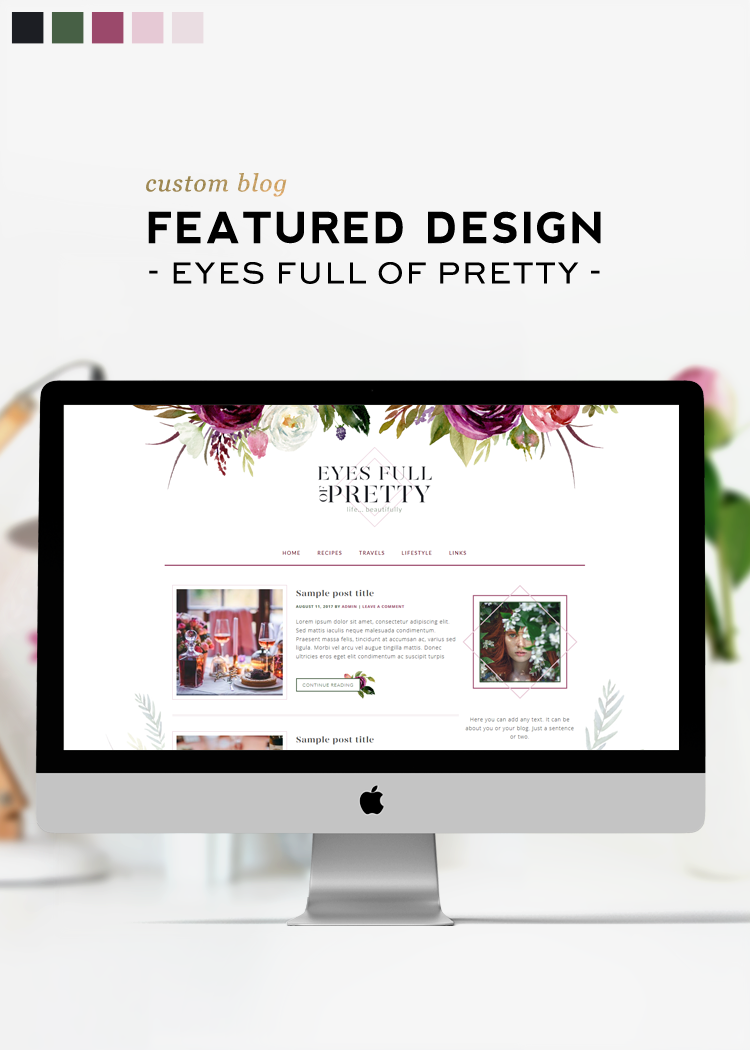
A few months ago we had the pleasure of working with Julie fromEyes Full of Pretty.She decided to go witha custom blog designwith a standard two column layout – with her posts on the left and everything else on the right.Our designer Kate was assigned to the project and was excited to have the chance to create a design with such a classic blog layout.
Developing the branding
The first step when creating new blog designs for our clients is to develop branding.Kate was very intrigued when she first saw the inspiration photos Julie sent to her.Julie's Pinterest board was chuck-full of dark purple and violet peonies, plum and cream flowers, and dark wallpapers.From the very beginning, Julie had a strong vision of what she wanted and knew she wanted her blog to be different but still stylish and feminine.
Kate started by developing a logo as it's the most important element for every brand.Julie wanted it to be simple and timeless but she also wanted an alternative logo symbol to use for social media and other branding materials.
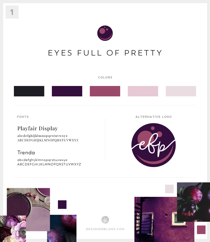
Based on the information provided, Kate came up with three unique logo options and mood boards.
After Julie reviewed the designs, she decided to go with option#3 and mix it with colors from the other boards.The final result can be seen below:
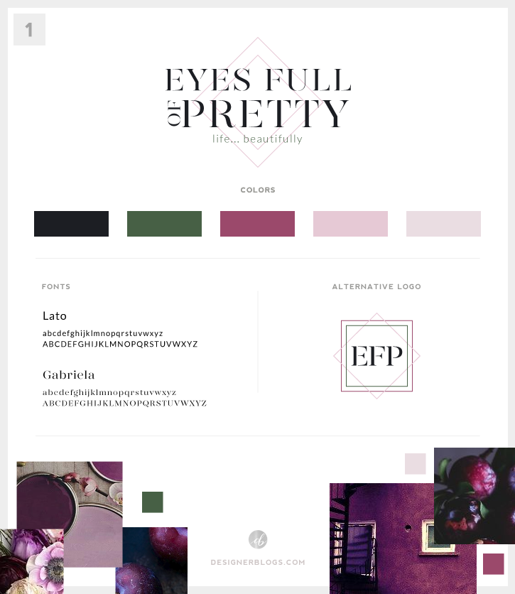
Julie loved the final effect as do we!It is so stylish, yet still neutral.The green and violet shades make for such a stunning color palette!
Creating the blog design
With the mood board in place, we were still missing one important element that Julie really wanted to incorporate- flowers.They needed something to match the color palette of the mood board so Kate began browsing her huge graphics library.Kate usually starts by trying to find something she already owns with the proper licensing to use in her custom design projects.Kate has such a huge library of graphics, that she is usually able to find something.If by chance she can't, then she'll ask clients for help finding something they like online (sometimes this requires additional fees, so keep that in mind when ordering a custom).
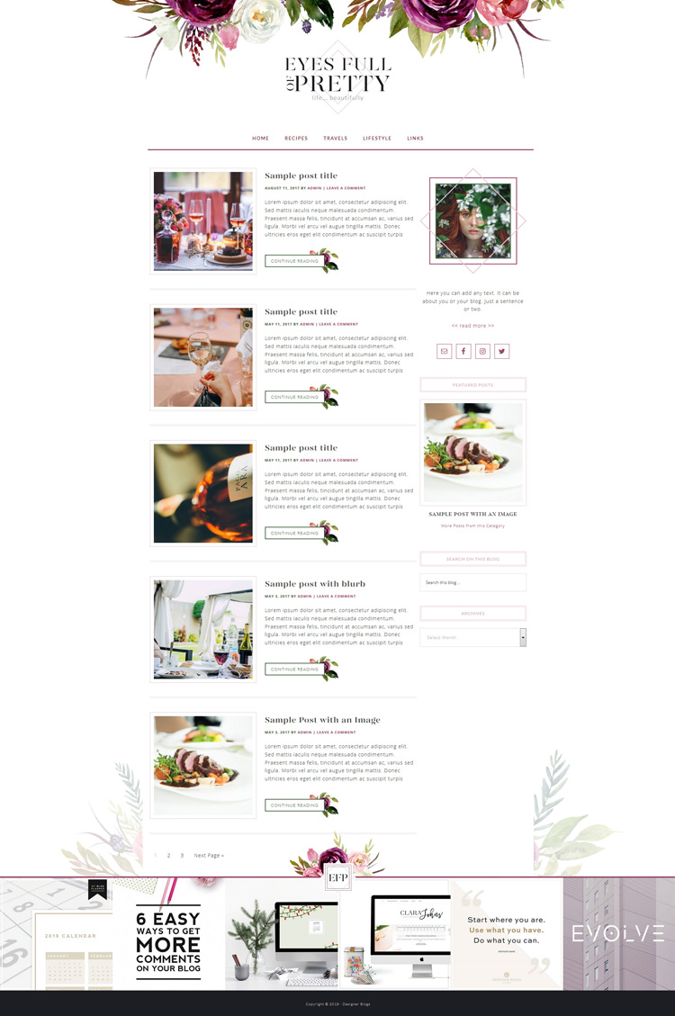
Fortunately, Kate ended up having a gorgeous watercolor boho set in her graphics library just waiting to be used in this project.You can preview it atCreative Market.Kate used elements from the graphic on Julie's header design, background, favicon, and other small embellishments throughout the site.
Here is a full-length view of the final blog design:
Final thoughts
From start to finish, Julie's project took us about two weeks to create.We love the way it turned out and would love to hear your thoughts on it.
If you are looking for a custom blog or website design, visit ourCustom Design Servicespage to request a quote.



Leave a Reply