Today's feature is a custom on which we were working for about a month.Natanja from Home Baked Bliss already had a working blog when she contacted us.It was a simple two-column layout custom made for her.We have even made a printscreen to show you before/after changes.Here is how it was looking:

Her design was perfectly fine (maybe except social media buttons in the sidebar which were definitely missing) but she needed an upgrade.From sites she linked as inspiration, we knew that we need to start from scratches and build something completely new with a modern landing page and large images.
Finding the perfect style
Everything starts with picking a perfect font and color combinations.This project was not an exception.In the beginning, the plan was to use pink or yellow with gold accents.Natanja had few favorite fonts so we have put everything together and presented her those three mood boards:
It will be not a huge suprise that the final version looks almost completely different.Sometimes, we know that something is not in our style only when we will actually see it.It is why this step is the most important part of the whole process.If we will be able to create a perfect mood board, the rest should go smooth.
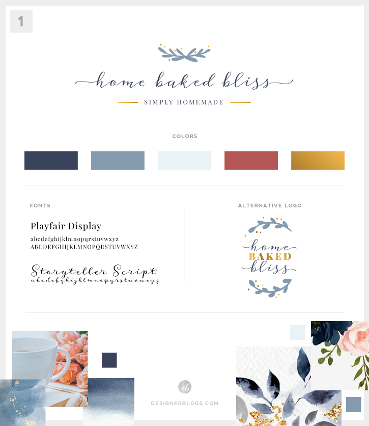
We were trying different colors for this website, but none of them were looking as it should.We went from yellow and pink to greys only to decide we do not need colors at all.Here is the final version which was used to create a website design for Home Baked Bliss:

I'm personally a fan of minimalistic solutions so I couldn't be happier to work on this project with such a mood board.
Creating the website design
The main goals were creating a modern, simple, and minimalistic design to showcase Natanja posts divided into few sections.Recently we have noticed an increased interest in adding animation and various sliders thru the homepage.In the past, sliders were present only at the top.Now they can be used to add some movement to your site.Make sure to visit Home Baked Bliss to see how her section appears and move!
Below you can see the final look:

Final thoughts
As an author, I must say that it is my first blog-like website with so many vertical sections.I was a little bit afraid that it may be too dull with so many repeating contents and just two colors, but I really like the final results.
We asked Natanja for short feedback and it is what she wrote:
It was a pleasure to work with Kate.She always took a lot of time to read and answer all my emails and always respond in a timely manner.I can definitely recommend working with her!
If you are looking for a custom blog or website design, visit ourCustom Design Servicespage to request a quote.


Leave a Reply