I just realized that I haven't shared any of our recent designs with you all.With so many tasks on my plate, like creating tutorials and helping out with blogs, I always seem to push these posts to the back burner.But, I'm finally making it a priority and would like to share with you one of my most recent projects –Salisbury Home.
What we had and what I needed to make
We absolutely love helping clients bring their ideas to life through ourcustom design service.I work closely with each client to create a unique brand identity that perfectly captures their vision.Usually, I start from scratch and carefully craft every aspect of the branding, including a sleek logo that truly embodies the brand's essence, carefully chosen fonts that convey the right tone and personality, and eye-catching colors that make the brand stand out.I pay close attention to every detail to ensure that each client receives a one-of-a-kind brand identity that truly sets them apart from the competition.
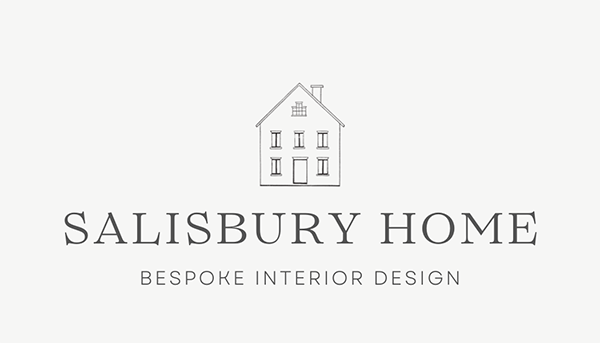
This time, I was presented with a premade logo, which is completely fine but sometimes can be a little problematic.If the logo was made correctly, you should have it in a vector format (usually .svg, .pdf or .ai) or at least on a transparent background.For this project, I got the following file:

The logo image was not ideal because it was small and had a grey background.Unfortunately, this didn't match the client's desired cream background for the website, so using the logo as it is would have looked odd.
I made some changes to the logo to make it more versatile.Specifically, I removed the background and replaced the fonts with similar ones.These adjustments allowed me to use the logo in various design elements while maintaining a cohesive look.
It is the final mood board look with new fonts and colors:

If you are looking for a custom-made design, contact us via ourcustom design services page.I would love to chat with you and discuss possible options.
Creating the design
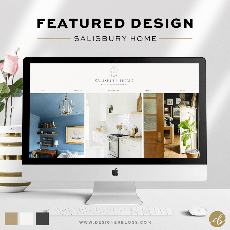
After finalizing the mood board and getting the go-ahead from the client, I began creating the design for their website.The client specifically requested a modern and clean look, with the main emphasis being on showcasing their stunning project photos.Due to the majority of the photos being in a vertical format, I opted to use a carousel slider for the homepage.I also utilized a few horizontal images as decorative elements for areas where there was text.
I was thrilled to come up with a design that featured a non-white background.While this isn't always the most common choice as it may not work well with all sites, I believe it was the perfect option for this particular project.
Here is a full view of the featured design:

I really like simple designs that focus on content photos.I think they allow for the photos to really stand out and be the main focus of the design.Plus, it makes the overall look very clean and easy to navigate.
What are your thoughts?Let me know what you think in the comments below!
If you are looking for a custom-made design, contact us via ourcustom design services page.I would love to chat with you and discuss possible options.


Leave a Reply